Logo & Brand
Everything the project signs — the documentation, the repositories, a talk slide, a link shared on LinkedIn — uses the same red mark, and the same three animals turn up around it. This page is the collection: every asset the project puts its name on, the colors behind them, and what may be done with them.
The files are the originals. Download them from the links, and prefer them over a screenshot of one, a copy pasted out of a slide deck, or a copy re-uploaded somewhere else — those drift in color and lose their transparency.
The Mark
The abap2UI5 mark: the wordmark set on two lines, tilted, knocked out of a red circle. This is the primary asset — where only one image fits, this is the one.
| File | logo.png |
| Size | 1064 × 1042, PNG, transparent background |
| Used by | the nav bar and the home page hero of this site |
The background is transparent, so the mark sits on whatever is behind it. On a dark surface the white letters stay readable, because they are knocked out of the red rather than printed on it.
The Mark on White
The same mark with a white background baked in, for the places that cannot handle transparency — an older presentation tool, a print shop, a chat client that flattens a PNG onto black.
| File | logo_white_back.png |
| Size | 1193 × 1081, PNG, opaque white background |
If the surface behind it is white anyway, use the mark — a transparent file cannot go wrong on a white page, and an opaque one shows its edges the day the page turns gray.
Favicon
The mark at tab size. The browser tab of this documentation. An abap2UI5 app
sets its own tab icon from the running app, with the set_favicon frontend
event — see Title.

| File | favicon.ico, favicon.png, apple-touch-icon.png |
| Size | 16 / 32 / 48 in the .ico, 64 as PNG, 180 for a home screen |
| Used by | the head every page carries, from scripts/build-site.mjs |
Link Preview
What LinkedIn, Slack, WhatsApp and X show when a documentation link is shared: the mark, the name and the one-line claim, on white. 1200 × 630 — the ratio those platforms render as a large card rather than a thumbnail.
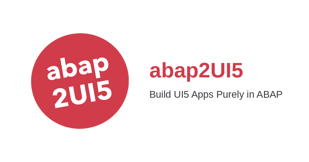
| File | og-image.png |
| Size | 1200 × 630, PNG |
| Used by | the og:image every page of this site carries |
Every page shares this one image. The title and description under it are
per-page — scripts/build-site.mjs writes the head of every page — so a shared
link names the page it points at, under the project's picture.
Code Cover
The project in three lines of ABAP: a main method that displays a message
box. Used as a cover image where a mark alone says too little — an article
header, a slide, a repository social preview.
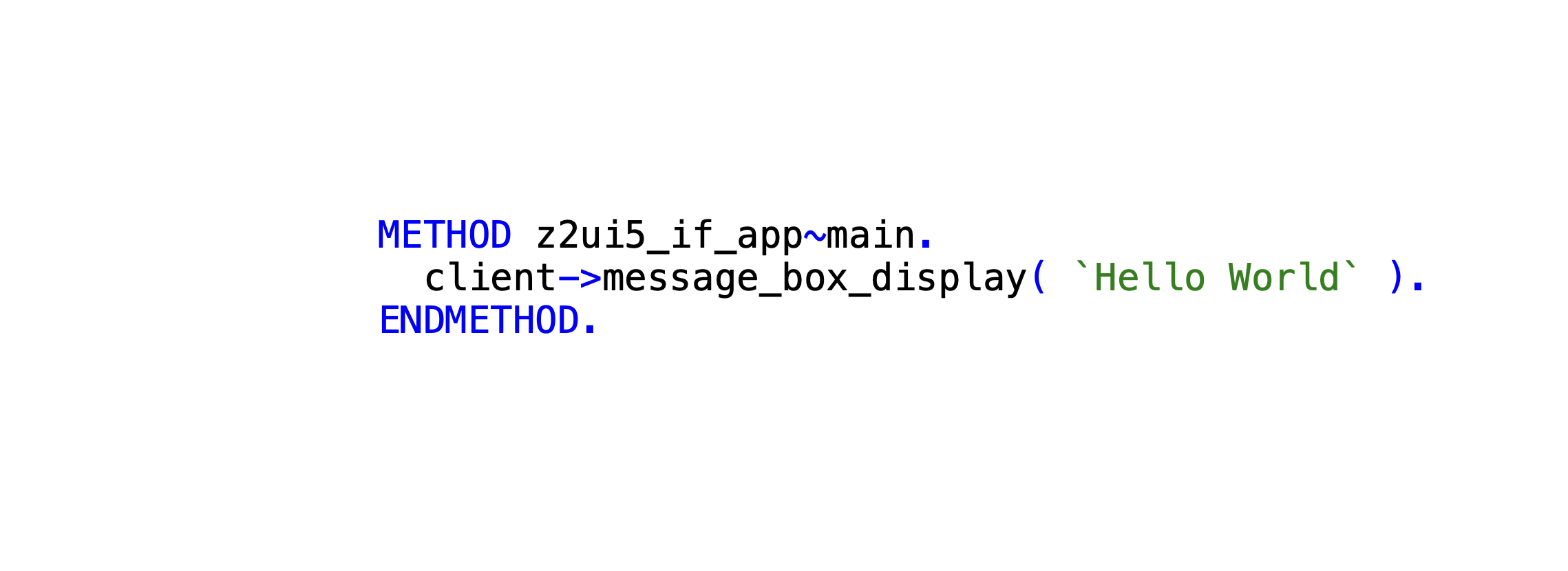
| File | code_cover.png |
| Size | 2278 × 830, PNG, transparent background |
Mascots
Three animals travel with the project — on posts, slides and covers, where the mark alone is a logo and an animal is a picture. They are drawings, not marks: they stand next to the logo, never in place of it.
Each one is a character, and between them they are most of a development team. Pick the one that fits what the picture is about; on a given day every one of us is one of the three.
Each animal comes in three files, the same way the mark does: a transparent PNG to use, a copy on white for the places that cannot handle transparency, and the artwork as it was drawn.
Every animal arrived on a red of its own — #C12E2B, #A62219 and, under the
JPEG noise, roughly #F5011D — three reds that are each almost, but not quite,
the red of the mark. The brand copies move that red onto #D03C4A: the flat
fill of each drawing lands on it exactly, so a mascot next to the logo is the
same red as the logo. Only the red ink moved, in proportion to how much of it a
pixel carries — shading and highlights become darker and lighter shades of that
one red, and the outlines and the sloth's cream fur are untouched.
The transparent copies are cut out along the drawing, not along its white. The white behind the sheep and the white of its wool are the same white, so the background was found by flooding in from the border — white that no path from the edge reaches is inside the animal and stays: the wool, the monitor, the keyboard. The soft gray edge these drawings carry is dropped rather than kept half-transparent, which is what would otherwise show as a gray halo on every background that is not white.
Sloth
The expert — and happy to show you, at length, exactly how any of it works. The laziness is pointed at the work, not at the question: rather than build the thing the long way, the sloth goes looking for a shorter one. Which is a fair description of how a framework like this comes about.

| Use | sloth_brand.png — 400 × 400, PNG, transparent |
| On white | sloth_brand_white_back.png |
| As drawn | sloth.jpg — a JPEG, so it carries compression artifacts along the outline; the copies above are PNGs and add none of their own |
| Red | ≈ #F5011D → #D03C4A |


Dinosaur
The old hand. Thirty years of ABAP, and a long memory of new things that were going to change everything. Unimpressed by this one too, and not always wrong about that.
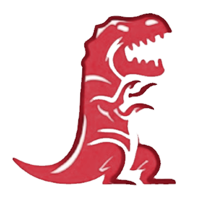
| Use | dinosaur_brand.png — 400 × 400, PNG, transparent |
| On white | dinosaur_brand_white_back.png |
| As drawn | dinosaur.png |
| Red | #C12E2B → #D03C4A |
Sheep
The enthusiast. Tries every new thing the week it appears, follows every tutorial to the end — and could not quite tell you afterwards how any of it works.
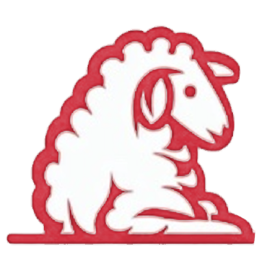
| Use | sheep_brand.png — 400 × 400, PNG, transparent |
| On white | sheep_brand_white_back.png |
| As drawn | sheep.png |
| Red | #A62219 → #D03C4A |
What is white inside an animal stays white — the wool, the screen, the keys. On a dark background that white is what you see, because it is part of the drawing and not the surface behind it.
Colors
One red, and it is the mark's. The circle in the wordmark, the red ink of every mascot above — one value, and no second shade for a hover or a pressed state anywhere it is used.
The mark is not the same thing as the interface around it, and the two carry different colors on purpose. The three sites this project publishes — this documentation, the playground and the sample catalog — share one bar, one palette and one accent, and that accent is SAP blue: it is the color of the platform these apps run on, it is what the playground fills its Run button with, and it clears AA for body text in both themes, which the red does not do on a dark ground. So a link on this page is blue and the mark at the top of it is red, and neither is a mistake.
| Hex | Where | |
|---|---|---|
| Red | #D03C4A |
the circle in the mark, and the red ink of the mascots |
| White | #FFFFFF |
the wordmark knocked out of the circle |
| Blue | #0A6ED1 |
the accent of all three sites — links, buttons, the hero name; #4AA3FF in dark |
A link under a cursor still gains an underline rather than a second shade, and a button still keeps its color: that rule was never about which color it was.
The site's own tokens come from the playground's own stylesheet, which this
build borrows whole (scripts/site-css/docs.css adds what only the manual
needs), so that the four stay one palette. Take the hex values from this table
rather than picking them out of a screenshot with a color dropper: a PNG scaled
in a browser hands you an interpolated pixel, which is a color that appears
nowhere in the brand.
Using the Mark
abap2UI5 is MIT licensed, and that covers these files along with the rest of the repository. The rules below are therefore a request, not a license term — but they are what keeps the mark recognizable:
- Use it to refer to the project. A talk, a blog post, a slide about your integration, a badge in your readme — no permission needed.
- Do not redraw or recolor it. The red is
#D03C4A, the circle is a circle, the wordmark is not retyped in another font. Scale it; that is all. - Do not stretch it. Both files are close to square but not exactly square. Set one dimension and let the other follow.
- Leave it room. Roughly half the circle's diameter of clear space on every side, free of other logos and text.
- Do not imply endorsement. The mark next to your product name reads as "the project ships this". Say "built with abap2UI5" instead — that is accurate and needs no mark at all.
- The animals are not the mark. The same rules cover them, with one more: a mascot may sit next to the logo, illustrate a slide or head a post, but the thing that identifies the project is the red circle.
For anything this page does not answer — a print resolution, a variant that does not exist here, permission for something the list above rules out — write to contact@abap2UI5.org.